CocosCreatorWeb调试模拟IphoneX
CocosCreator的web调试工具,默认提供了模拟多种设备分辨率的选项,但通常开发者都会有特殊的适配需求(适配iphonex等刘海屏),CocosCreator并没有涵盖到也很难涵盖到各种分辨率,不过开发者可以自行添加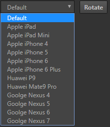
设置自定义分辨率
在CocosCreator\resources\static\preview-templates下的boot.js中有分辨率模拟选项的配置1
2
3
4
5
6
7
8
9
10
11
12
13
14
15
16// init device resolutions
var devices = [
{ name: 'Apple iPad', width: 1024, height: 768, ratio: 2 },
{ name: 'Apple iPad Mini', width: 1024, height: 768, ratio: 1 },
{ name: 'Apple iPhone 4', width: 320, height: 480, ratio: 2 },
{ name: 'Apple iPhone 5', width: 320, height: 568, ratio: 2 },
{ name: 'Apple iPhone 6', width: 375, height: 667, ratio: 2 },
{ name: 'Apple iPhone 6 Plus', width: 414, height: 736, ratio: 3 },
{ name: 'Huawei P9', width: 540, height: 960, ratio: 2},
{ name: 'Huawei Mate9 Pro', width: 720, height: 1280, ratio: 2},
{ name: 'Goolge Nexus 4', width: 384, height: 640, ratio: 2 },
{ name: 'Goolge Nexus 5', width: 360, height: 640, ratio: 3 },
{ name: 'Goolge Nexus 6', width: 412, height: 732, ratio: 3.5 },
{ name: 'Goolge Nexus 7', width: 960, height: 600, ratio: 2 },
{ name: 'Iphone X', width: 375, height: 812, ratio: 3 },
];
只需要按照已有的格式添加就可以了
- name:模拟器选项中展示的名字
- width:模拟器在网页上实际的宽度
- height:模拟器在网页上实际的高度
- ratio:字面意思是缩放比例,但是修改过后没有产生效果?
我在devices中加入了iphonex的分辨率信息1
{ name: 'Iphone X', width: 1125, height: 2436, ratio: 1 }
预览后发现游戏画面已经超过了浏览器窗口的大小,出现了滑动条,所以将宽高缩小3倍1
{ name: 'Iphone X', width: 375, height: 812, ratio: 3 },
刷新页面得到了能够正常预览的大小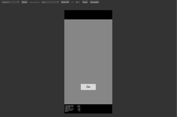
虽然web模拟器调试非常便利,但是适配IphoneX还是要以实机效果为准